Search the Community
Showing results for tags 'history'.
-
- 3 comments
-
- 4
-

-
- germany
- tschichold
-
(and 1 more)
Tagged with:
-
-
Printing Historical Society Prize for New Scholarship
Riccardo Sartori posted a news entry in Typography Weekly #124
A competition for a new article on any printing-historical subject, suitable for the The Printing Historical Society Journal. The winner will receive the prize for that year, a purse of £500, membership of the Society for one year, and publication in the PHS Journal. The competition is open to all, but those new to the subject are particularly encouraged to take part. -
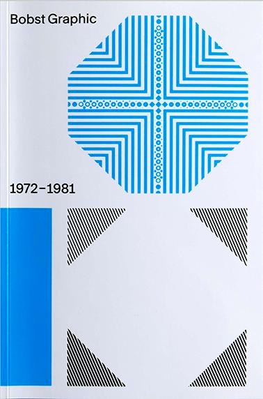
In the early 1970s, the Swiss packaging company Bobst S.A. began to wonder whether it would be ready for the future with only one product type. The Lausanne-based company, already far advanced in terms of packaging manufacturing technology, decided to launch phototypesetting machines. Thanks to the participation of some of the best font designers in the country, e.g. Team 77, different font families were developed for the new technique. The history of Bobst Graphic – a pioneering feat in the development of the phototypesetting at the time – has never been included in the rich history of Swiss graphic and font design.
-
- typography
- history
-
(and 1 more)
Tagged with:
-
-
- type design
- interpolation
-
(and 2 more)
Tagged with:
-
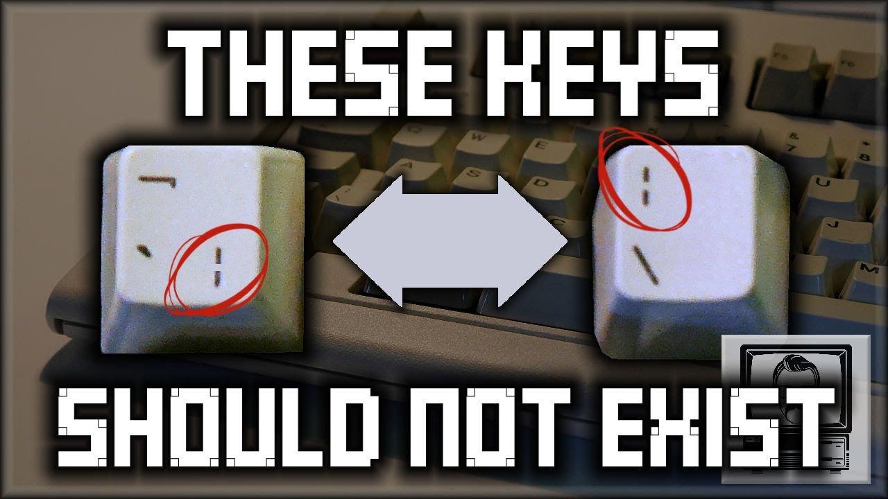
Welcome to the world of PIPE symbols, vertical lines and bars. Why are there two pipe symbols on a computer keyboard? Why are there two vertical lines on keyboards? Why does a solid line produce a broken line? ASCII? What does Ascii and character sets have to do with this? Why is the bar broken? Why is it no longer broken? What does ANY of this mean. Find out within (disclaimer: this video might actually confuse you more than you are right now).
-

Collection of Research on Chinese Typography
Riccardo Sartori posted a directory entry in Typography Books
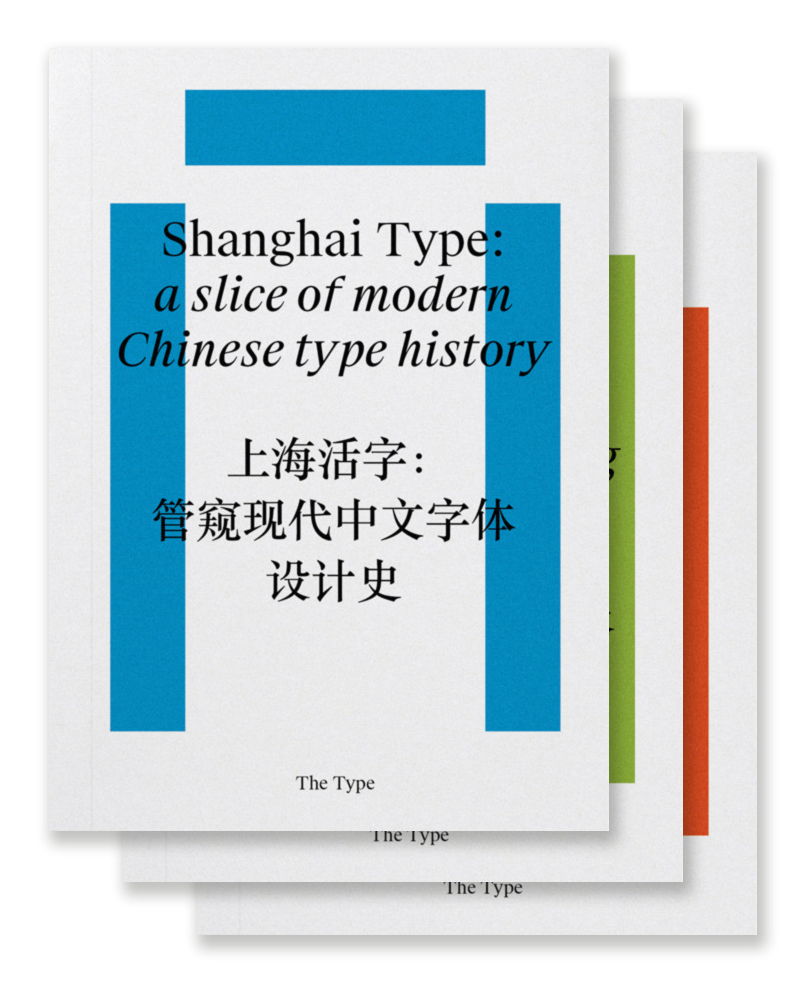
“Chinese typography is not easy to tackle, but we believe that, by more self-initiated and open research, we are able to address our challenges under a global perspective and invite more discussions and breakthroughs to the field. So here is a three-volume collection of our on-going research and dialogues about typography and design in China, including its history and development, conventions and contemporary practice, and working in transcultural contexts.” Shanghai Type: a slice of modern Chinese type history Transcultural Type Design: a dialogue from China Kǒngquè: restoring the mindset of Chinese typesetting-
- chinese
- typography
- (and 5 more)
-
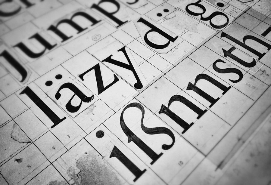
There's a lot of info online on how the long s (ſ) was used in past spelling, but not a lot about why it appears in the alternate forms it does, and what the expectations are today in modern type design if and when (rarely ever) its included or used. I've linked a few samples below, including ligatures ( long s+small roman s, which is often mistaken for the Esszett) for reference (nb. the normal ff ligature is included in comparison to the ſſ ligature). The alternation between Regular & Italic is of course the descender, which follows the same change as the lowercase 'f' between Regular & Italic. The inconsistent aspect which I'm highly curious about, and for which no apparent explanation is available to me, is the left-hand bar which appears on some typefaces, and not on others, or features only in either the Italic or Regular of the given type. What are your thoughts on these reasons? And on good design for the long s?
-

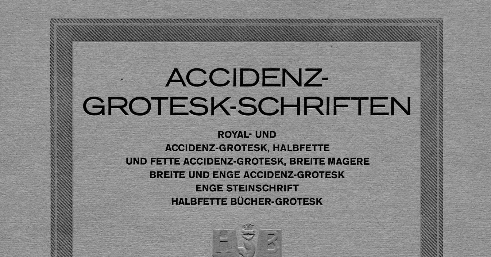
New details about the origins of Akzidenz-Grotesk
Riccardo Sartori posted a news entry in Typography Weekly #97
-
- history
- twentieth century
-
(and 1 more)
Tagged with:
-
-
Nice blog about a creative guy discovering his great, great grandfathers creative hoard of old wooden type and hand made icons and artwork. http://www.designbridge.com/bar-andrew-bainbridge-natural-history-letterforms/
-
- 1
-

-
- history
- letterforms
-
(and 3 more)
Tagged with:
-
The book. A cover-to-cover exploration of the most powerful object of our time
Przemysław Sakrajda posted a directory entry in Typography Books
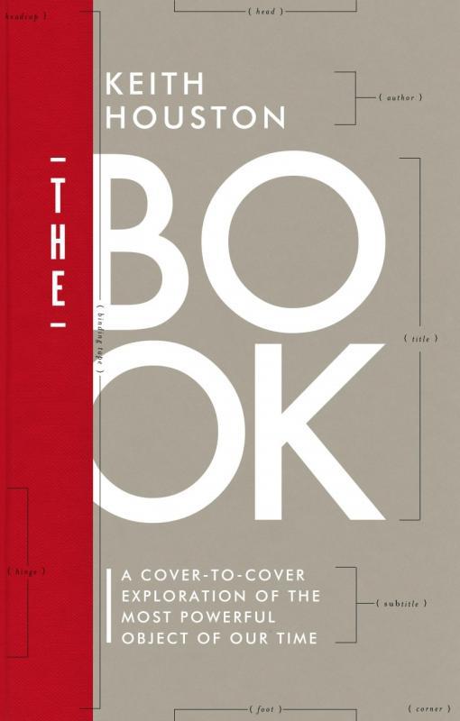
Second book of Keith Houston after „Shady Characters”. „The Book” is about the paper, ink, thread, glue and board from which a book is made. It’s an amazing travel through history of this 2,000 year-old medium: from tablets and papyrus scrolls to hard covers and paperbacks we have today. It’s a must-have for anyone interested in history of book making, but also for editorial designers and printers.-
- book making
- book
-
(and 2 more)
Tagged with:
-

Nancy Sharon Collins, Stationer LLC
The Engraving Lady posted a directory entry in Artisanal workshops & studios
Nancy Sharon Collins is an expert on engraved social stationery and author of The Complete Engraver—a guide to monograms, crests, ciphers, seals, and the etiquette and history of social stationery. Collins works in her eponymous studio, Nancy Sharon Collins, Stationer LLC in New Orleans, creating bespoke hand engraved social stationery. From there she also partners with cultural institutions nation wide providing classes and insight into the ways we humans get along in polite, and not so polite, society. Locally partners include Hermann-Grima+Gallier Historic Houses, THNOC, Antenna, and South Street Seaport Museum in NYC. She is AIGA New Orleans director -
-
- typography
- history
-
(and 3 more)
Tagged with:
-

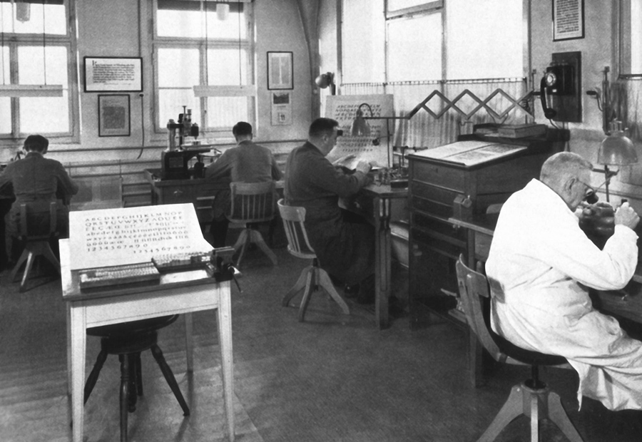
Pictures from the East-German type foundry Typoart
Ralf Herrmann posted a journal article in Journal
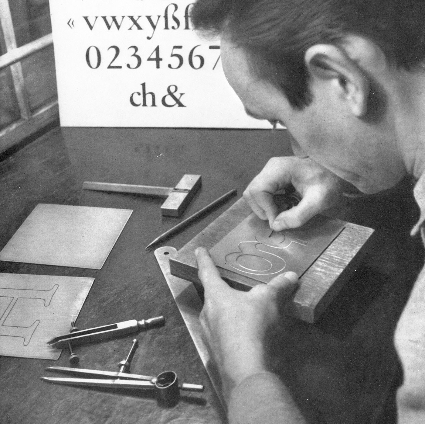
Making zinc sheet stencils Engraver at work Transferring the letter shape from the finished stencil Making a punch Punchcutter at work Making matrices for type casting Type casting machines Close-up of a type casting machine at work In-house printing with foundry type In-house press Making matrices for hot metal typesetting Checking the matrices Making phototypesetting fonts Digital font production at the end of the 1980s Photographic reproduction to test the design in smaller sizes -
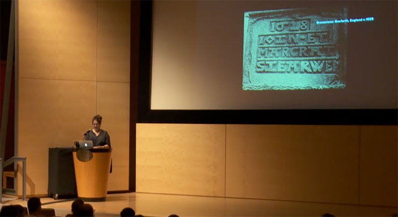
Stanley Morison argues in Politics and Script that the nineteenth-century invention of the sans serif lowercase was no less than ‘the most novel and permanent contribution to letter-design that has appeared on the printed page since the Aldine Italic of 1501’. Given that the sans serif has become the dominant typographic form of the past century (for all but lengthy text setting, and sometimes even for that too), it is more than a little surprising that its early development in the century prior — from a brutish all-caps poster style into a viable upper- and lowercase text style — has scarcely been studied or documented. This talk will trace its evolution as uncovered to date by a primary-source research project in progress. Sara Soskolne is senior designer at Hoefler & Co. Though originally a graphic designer in her home town of Toronto, after ten years of apparently never being able to find quite the right typeface for the job she finally decided to just learn how to make them herself, jumping careers and an ocean to study typeface design at the University of Reading where she earned her MA in the subject in 2003. Since joining H&Co she has contributed to the design of a wide range of typefaces including Verlag, Chronicle, Sentinel, Gotham, Tungsten and Quarto. She has taught typeface design at the Yale School of Art, at New York’s School of Visual Arts, and with Sumner Stone was a founding instructor of the Type@Cooper Condensed Program.
-
¶ I'd like to start a thread about a topic that remains rather unclear. How do you define the typeface from the Victorian era? ¶ I always find four designers related to that kind: the German-born Carl Schraubstadter Jr, Gustave F. Schroeder and Hermann Ihlenburg the American John F. Cumming Oddly enough, not a single British designer is highlit. I watched some catalogues from French foundries of the late XIX th century with this kind of typeface. ¶ Can you help me with this riddle?
-
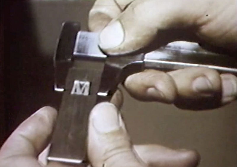
“Created by the American Type Founders Company, this film shows the most in-depth and visually easy-to-understand process of making type. It follows the entire process of type making from original design to pattern making, punch cutting, matrix making, and the use of the Benton engraving machine. For anyone interested in seeing the entire process of type manufacturing, this is one of the best films created.” Via printingfilms.com
-
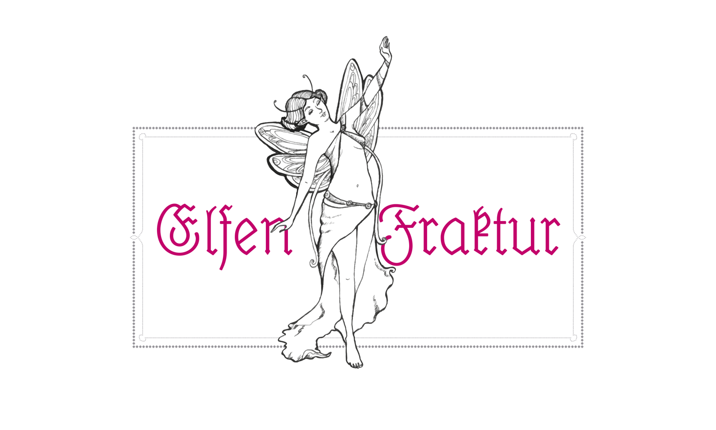
The “black” in the English term blackletter refers to usually very dark appearance of these kind of typefaces. But this appearance isn’t really the defining characteristic. The German term “Gebrochene Schrift” (broken script) says it much better. In blackletter fonts, elements which used to be rounded in preceding Latin designs were broken down to individual line segments with emphasised sharp corners. And since this type style developed somewhat independently of the Roman type style we use until today, blackletter developed some letter skeletons, which greatly differ from the Roman design and make them hard to read for many today. In Germany blackletter fonts were in broad use until the middle of the 20th century. The most used category of blackletter fonts was Fraktur—a much more open and legible design than the original dark and narrow blackletter fonts in medieval books. Fraktur fonts were available in a great variety of designs—from thin and delicate calligraphic typefaces to bold and geometric. But they all shared one characteristic: the typical change of weight caused by the use of a broad-nip pen. This feature could almost be understood as a necessity to make blackletter fonts work. Experimental monolinear blackletter fonts appeared occasionally like in this booklet for sign painters from a German pen maker who also sold pens for monolinear writing. But such designs rarely made it into typefaces. The only two know designs appeared around 1920: The wobbly Lehmann-Fraktur and Elfen-Fraktur from an otherwise unknown designer listed as M Beck. Elfen-Fraktur was originally published by the foundry H. Hoffmeister, which was later absorbed by D. Stempel, one of the largest type foundries in Europe at that time. The typeface then appeared in Stempel’s catalogue of 1925—with around 1200 pages one of the biggest type specimen book ever produced. Elfen-Fraktur in the 1925 Stempel catalog When I got my copy of this book and browsed through it, Elfen-Fraktur was the one design that fascinated me the most—but more for it’s uniqueness and peculiarities than its quality. It was by no means a perfect design. It’s easy to see how the designer struggled with the design concept. While it has a monolinear look, it actually can’t be written. The designer has added little corners and weight changes throughout the design to make it work as a blackletter typefaces. An ad in Elfen-Fraktur, published in a German newspaper in 1928 Even with the huge market share of Stempel, the typeface wasn’t used very often and is almost forgotten today. So a while ago I began to digitize and revamp it. The new version of Elfen-Fraktur is now available via FDI Type. But I didn’t actually trace the outlines to make a perfect copy of the original. Instead, I used the specialty of the original design and drew all letter from scratch as monolinear letters and then refined the details. The FDI version of Elfen-Fraktur comes in two versions. Style A sticks rather close to the original letter skeletons. In combination with the discretionary ligatures it is perfect for setting German texts according to traditional blackletter and orthography rules. Style B contains alternative letters which make the typeface more legible for readers, who don’t have experience in reading Fraktur. Both sets are otherwise identical and contain the full Western character set (Win1252/Mac Roman). A free bonus is a set of 22 decorative border elements, which can be used in combination with Elfen-Fraktur or any other typeface. The border elements can directly be typed on the keyboard (letters a to v). The size of the elements (including the space character) is based on the em-square. So by keeping the tracking to zero and the line height identical to the font size the border elements will always connect seamlessly. Related links: Elfen-Fraktur at FDI Type Elfen-Fraktur at MyFonts
-
330 pages filled with the history of alphabet, the anatomy of the letterform, and how wood type was made. Personal stories from artists, typographic designers, the new uses of wood type in printing from two university professors, and the story of the world’s largest collector of wood type, Leo Kaplan, the Grandfather of the wood type collage and Dave Greer, the largest collector of rare wood and metal type. The book is not available in stores, but can be ordered via [email protected]
-
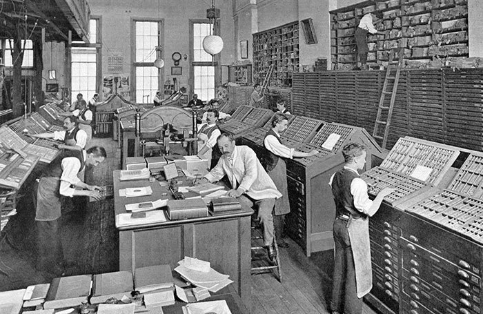
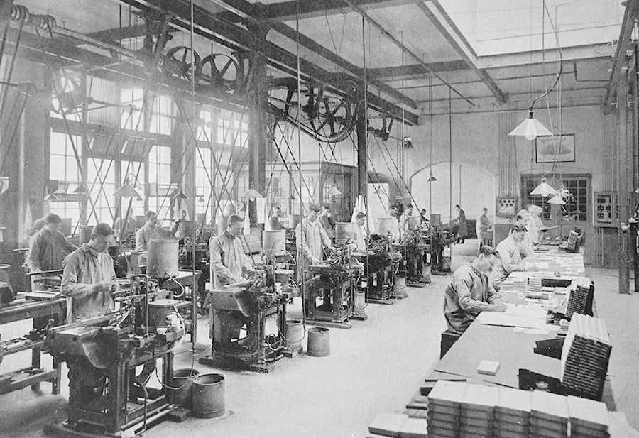
In 1796 Binny & Ronaldson established the first permanent type foundry in the United States. The foundry was also known as The Philadelphia Type Foundry. In 1812 the foundry is supposed to have issued the first type specimen book ever produced in the United States. In 1833—after Binny and Ronaldson had retired—the foundry was purchased by Lawrence Johnson and George F. Smith. It was combined with Lawrence Johnson’s existing stereotype foundry and greatly expanded. In 1845 Johnson brought in three junior partners: Thomas MacKellar, John F. Smith and Richard Smith and in 1897 the foundry took on the name MacKellar, Smiths and Jordon, upon the addition of Peter A. Jordon as a partner. In 1896—100 years after Binny & Ronaldson had founded the company—MacKellar, Smiths and Jordon published a book which celebrated the history of the company. The following images are taken from that book and show how type was made at the end of the 19th century. Metal-mixing Department Making the Matrix Making Type-Moulds Fire-proof Vault for storing Matrices and Moulds Hand Type-casting Department Automatic Type-casting Department Electrotyping The Foundry Stock Room Financial and Commercial Departments Sales and Shipping Bookkeeping and Correspondence Department Printing Department (Original scans by Villanova University published under Creative Commons, BY-SA 3.0)
-
- 1
-

-
- philadelphia
- usa
-
(and 2 more)
Tagged with:
-
Typedia was a shared encyclopaedia of typefaces, a resource to classify, categorize, and connect typefaces.
-
- repository
- history
-
(and 1 more)
Tagged with:
-
-
- history
- the netherlands
-
(and 2 more)
Tagged with:


