Search the Community
Showing results for tags 'lettering'.
-
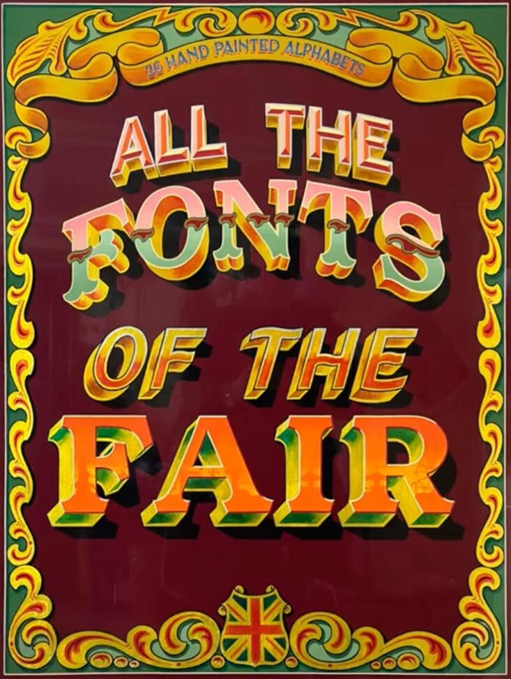
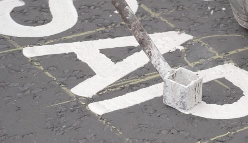
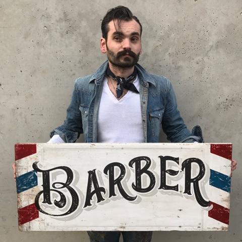
All the Fonts of the Fair, Joby Carter’s second book, takes a deep dive into fancy lettering styles found at traditional British fairgrounds up until the 1960s. Many of these vibrant, whimsical designs are missing from graphic design manuals and typography archives. This book helps continue their legacy and give them a new lease of life. This full colour book includes 26 hand drawn fairground inspired alphabets. Each alphabet has a reference guide with tips on how to accurately recreate the lettering alongside details about the origin of the style and photographs of variations of the lettering in use. The alphabets represent an enormous amount of hours in the workshop with each letter drawn, painted and decorated by hand, ensuring it worked alongside the other alphabet letters and could stand up to scrutiny and be accurately copied and scaled. https://jobycarter.com/product/all-the-fonts-of-the-fair/
-
- lettering
- fairground
-
(and 1 more)
Tagged with:
-

Free lettering master class with Martina Flor
Ralf Herrmann posted a news entry in Typography Weekly #117
-

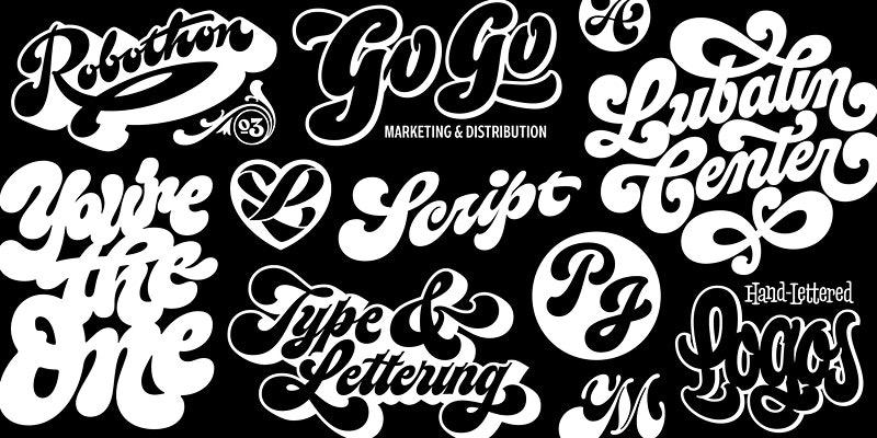
Online workshop with Ken Barber: Juicy Script Lettering
Ralf Herrmann posted a news entry in Typography Weekly #115
-

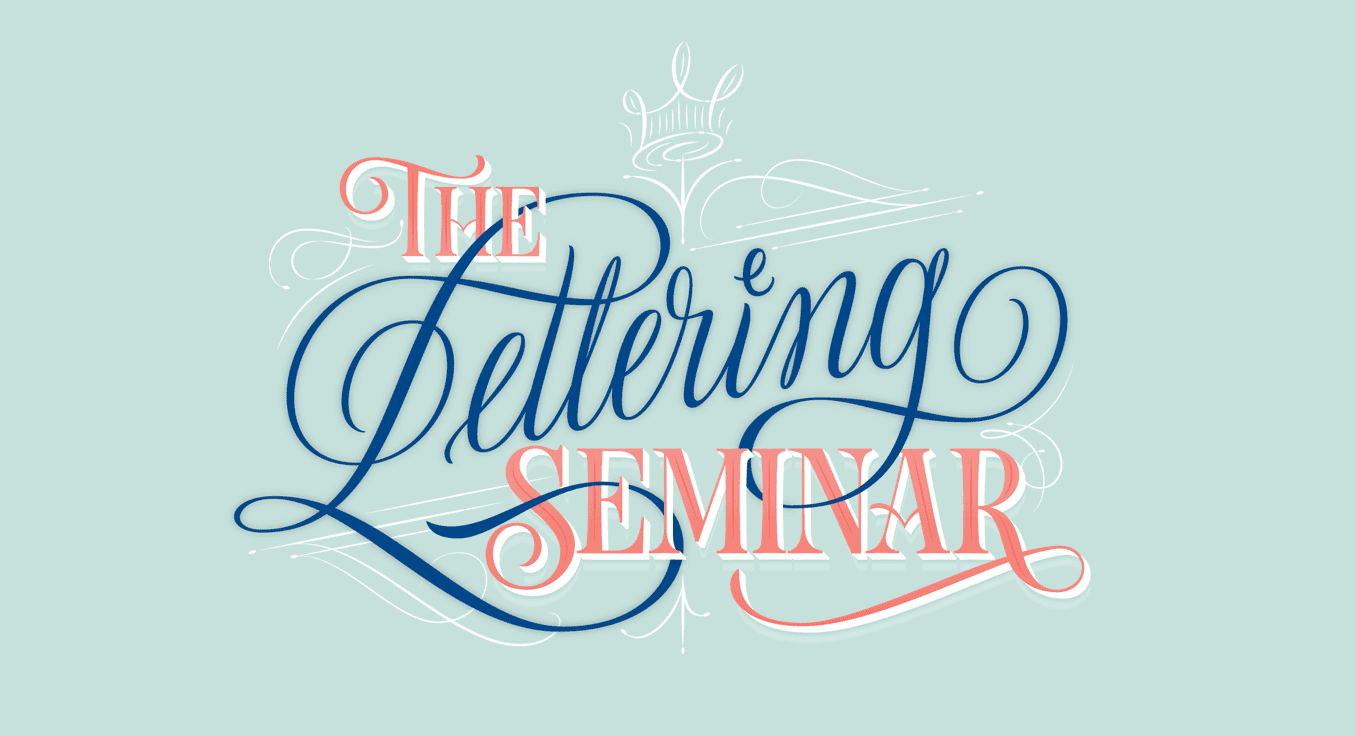
The Lettering Seminar by Martina Flor. Enrollment opened
Ralf Herrmann posted a news entry in Typography Weekly #111
-
-
In addition to the type specimen links collection topic, I start another one which deals with lettering. Feel free to add links you know of.
-

New online class with Martina Flor: Digital Lettering
Ralf Herrmann posted a news entry in Typography Weekly #94
-
- lettering
- calligraphy
-
(and 1 more)
Tagged with:
-
Jessica Hische is a letterer and illustrator working in San Francisco. She is teaching online classes and workshops on Skillshare, for example: Logotype Masterclass with Jessica Hische Lettering for Designers: One Drop Cap Letterform at a Time Illustrated Lettering: Design a Book Cover with Jessica Hische
-
- skillshare
- jessicahische
-
(and 3 more)
Tagged with:
-
-

Why there isn’t a font behind every letter you see
Ralf Herrmann posted a journal article in Journal
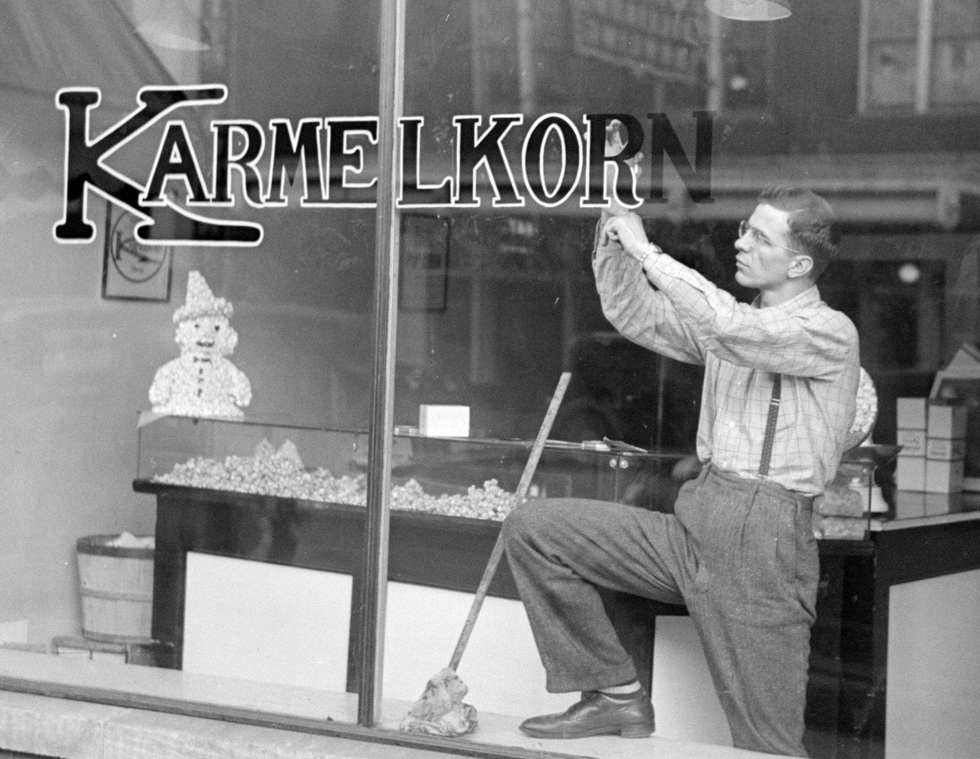
Today we take it for granted to use fonts for almost anything. Not just printed matter, but also logos, stamps, t-shirts, neon letters, and so on. Anything is possible—we just need to provide an image file. But this is a rather new development, considering how long movable type is in use. Over more than 500 years, fonts (made from metal or wood) were connected to letterpress printing, were each letter had to be made in the target print size, arranged by a typesetter, inked and finally printed on a surface like paper. That’s how things like the text block of books, flyers, letter heads, business cards, or posters were being made. But this technique was not suitable in many other areas. Think of a 50 inch sign on a train station building for example. It wouldn’t make sense to create a set of 50 inch letters just for this case and then press these huge letters against a sign or even the building wall itself. It was done differently and the following sections describe typical areas where letters were often not created using fonts. The Signpainter Signs over shops or on shop windows, political banners, train station signs, advertising boards and banners, large-scale ads on walls—those are all uses usually created by sign painters in the past. A sign painter could draw or write alphabets in many different styles, but his job had little to do with the letterpress letters used in print shops. The sign painter’s tool were brushes and pencils and every sign was usually a unique design, with letters specifically drawn for this one use. That’s what we call lettering. Sign painter training But it wasn’t just advertising. Even street signs, or the signage for busses or trains could have been lettering. If the same letters had to be repeated over and over again, there might have been stencils or technical drawings for each letter. But those were usually just for internal use, not sold publicly like letterpress fonts. And because of that, there was often not even a need to name the sets of letters just used internally. And so we also cannot identify a certain name in hindsight. The only chance is that the sign painter’s alphabets were interesting enough for someone to create a font later based on the original lettering design. A sign painter working on streetcar signs in the 1940s. Older logos, like the one from Coca-Cola in this case, were almost always drawn, not made from fonts Logos and mastheads Setting the logo of a brand or company in a certain typeface—or at least to base the design on a typeface—is very common today. But before the computer, logos were almost always created as individual drawings by a graphic designers. The same is true for mastheads of newspapers and magazines. They weren’t printed every time from moveable type. The were designed once and then turned into a printing block or “logotype”. In fact, this is were the term logo comes from originally. Combining several letters or full words to one unit was called a logotype (from Greek: logos → word). And since this was so common for the names of companies, logotype (or logo for short) became a synonym for visual trade marks of any kind, even the ones that don’t contain letters or words. Book covers The body copy of books is usually being printed from moveable type since Johannes Gutenberg. But the same was not necessarily true for book covers and dust jackets. They are designed by illustrators and graphic designers and before the computer, if there were letters, they were created as lettering—drawn in the original size just for this one use. And while it was less common, title pages or pages starting new chapters could also get such a lettering treatment. Product lettering Clock faces, food and cosmetics packaging, tube radios, vacuum cleaners, coffee makers and so—letterpress fonts weren’t suitable for putting letters on such products in the past. So even if the design of letters on such product looks similar to letterpress fonts, they were usually not made using fonts. Stonemasonry Just as the sign painters created the lettering on signs, stone cutters created the lettering on stones, may it be inscriptions on walls, tombstones, or on plaques mounted on buildings. And even while the letters might look as uniform as the ones in a typical font, before the computer, such stone cuttings were usually not made using fonts. The letters were designed and carved by the stone cutter for the specific application. Handwriting/calligraphy Most of the examples mentioned above fall into the category we call lettering. But letters can also be created with a another technique, that neither is lettering nor uses fonts: handwriting (or calligraphy, as we call it as an art form). Many requests in our font identification forum simply show handwriting, but people still ask for a “font identification”. Typing everything has become so common today, it might not even occur to people anymore, that things like logos, poster texts, or advertising claims might be handwritten. And modern script OpenType fonts might indeed even look a lot like lettering or calligraphy. But usually, if one takes a closer look, handwritten texts and fonts can still be distinguished very clearly.- 2 comments
-
- 3
-

-
- lettering
- calligraphy
-
(and 1 more)
Tagged with:
-

Nancy Sharon Collins, Stationer LLC
The Engraving Lady posted a directory entry in Artisanal workshops & studios
Nancy Sharon Collins is an expert on engraved social stationery and author of The Complete Engraver—a guide to monograms, crests, ciphers, seals, and the etiquette and history of social stationery. Collins works in her eponymous studio, Nancy Sharon Collins, Stationer LLC in New Orleans, creating bespoke hand engraved social stationery. From there she also partners with cultural institutions nation wide providing classes and insight into the ways we humans get along in polite, and not so polite, society. Locally partners include Hermann-Grima+Gallier Historic Houses, THNOC, Antenna, and South Street Seaport Museum in NYC. She is AIGA New Orleans director -

Ruth Rowland Lettering Artist
Ruth Rowland Lettering posted a directory entry in Artisanal workshops & studios
Ruth Rowland is a lettering artist and illustrator for over 25 years. Based in London, UK, she enjoys working with clients from all over the world from the music, advertising, editorial and publishing industries. She creates unique custom hand lettering, calligraphy and handwriting for books, magazines, albums and posters amongst many other projects. She also enjoys designing illustrative maps, hand lettered diagrams and word-heavy illustration, creating playful, informative infographics that engages audiences.-
- ruth rowland
- lettering artist
- (and 8 more)
-
-
- lettering
- calligraphy
-
(and 1 more)
Tagged with:
-
-
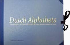
Dutch Alphabets is a portfolio containing 47 broadsides featuring new samples of lettering and writing by today’s most significant ‘Dutch’ lettering artists, type designers, calligraphers and sign painters. All the contributors are working and/or educated in the Netherlands. This collection of lettering has been compiled by Mathieu Lommen (University of Amsterdam) & Peter Verheul (Royal Academy of Art, The Hague), and was published in a limited edition. It showcases a wide variety of lettering and calligraphy, made especially for this project by: Amsterdam Signpainters / Yomar Augusto / Jacques le Bailly / Donald Beekman / Françoise Berserik / Barbara Bigosińska / Frank E. Blokland / Erik van Blokland / Maria Doreuli / James Edmondson / Ramiro Espinoza / Martina Flor / Dave Foster / Fritz Grögel / Janno Hahn / Hansje van Halem / Berton Hasebe / Henry van der Horst / Ondrej Jób / Max Kisman / René Knip / Holger Königsdörfer / Paul van der Laan / Lida Lopes Cardozo / Niels Shoe Meulman / Ross Milne / Gerrit Noordzij / Diana Ovezea / Krista Radoeva / Trine Rask / Arthur Reinders Folmer / Donald Roos / Pieter van Rosmalen / Just van Rossum / Kristyan Sarkis / Florian Schick / Elmo van Slingerland / Heidi Sørensen / Nina Stössinger / Joost Swarte / Teo Tuominen / Underware / Gerard Unger / Peter Verheul / Bernd Volmer / Job Wouters Offered in a collectors’ limited edition of only 175, with contributors’ copies separately reserved and numbered, Dutch Alphabets is printed offset on heavy acid-free paper in seven PMS colours and black. The broadsides and the introduction are housed in an attractive handmade cloth-covered portfolio with ties. The portfolio costs € 160,– and is available from the Publisher or Typotheque.
-
-
-

Lettering vs. Type Design: 7 questions for Ksenia Belobrova
Ralf Herrmann posted a journal article in Journal
1. To begin with, please tell our readers a little bit about yourself and how you became interested in drawing letters. I think the most interesting thing about me is that I grew up in a provincial town near the sea. I did spend my time sailing yachts, playing the violin and painting. When I was seventeen I left my lovely hometown and moved to Moscow. My passion was art and I was planning to become a book illustrator and designer because I love books and everything related to them. So I passed my exams and started studying at Moscow State University of Printing Arts. There I learned a lot about art and design history, illustration and book design. But for me the most important course was calligraphy and type design class led by Alexander Tarbeev. I fell in love with typography and type design. And I found the perfect teacher. Since then my ruling passion in life has been drawing letters. I practice calligraphy, draw letterings, logotypes and work on typefaces. My hobbies are music and art. I play the guitar, study singing and of course draw and paint when I have free time. 2. How many years did you practise calligraphy and lettering and what was your first lettering/calligraphy job? I have been doing it for about eight years now. My first calligraphy attempts had to do with the beginning of Alexander Tarbeev’s class and it was nearly eight years ago. Since then I’ve been practising hard, but it was just for myself. I studied calligraphy, drawing non-commercial letterings and typefaces a lot. And honestly I don’t remember what was my first commercial lettering job. But my first released typeface was Voltaire script made in Artem Gorbunov’s design bureau. It was my first big commercial project and I was happy with the result. 3. If you had to pick one lettering/calligraphy job you are most proud of, which one would it be? Tell us a little bit how this project came about and what you liked about working on it. That’s hard! I’m afraid I can’t choose one. And I’m not too proud of any of my works because they always could have been better. I’m a perfectionist so I struggle with that all the time. But I can choose one project that is very important for me despite being old and noncommercial: the posters for the Ukranian calligraphy and typography festival Rutenia. I was an unknown student and I was afraid of everything. But it was an amazing event and the task was both interesting and difficult, so it was a real challenge. I wanted to try my skills and it took me 3 days to make the posters. I mixed European calligraphy with old Cyrillic calligraphy traditions. I was proud of the result and I received a lot of appreciation from people I respect and admire very much. That was a perfect beginning and that encouraged me to work even harder. 4. What is your ideal creative environment? Where do you work? Studio space? Home office? Co-working? I used to work at home. It’s difficult for me to focus on the work though when it’s noisy or you get disturbed in any other way. Sometimes I work in co-working spaces, but not so often. 5. Now let’s move on to your latest release. What was the inspiration, goal or idea behind the development of Jonesy? And what uses for it do you have in mind? I love monoline connected signs. I love the way they look and I think they are perfect for street signs, logotypes and small typography too. I’ve seen many of them during my trips through Europe. But there are not so many typefaces in this fashion. And that’s understandable, because it’s rather complicated to create them. If a typeface you work on is just a monoline without connections, that’s OK. If a typeface is connected but it’s not monoline, that’s OK as well. But if it’s monoline and connected at the same time, you are in trouble. You have to work on letterforms a lot to make them acceptable even a bit. Then you will realize that it’s absolutely not possible in some combinations and you have to create a lot of alternates and ligatures. In the case of Jonesy it’s been hundreds. Of course I talk about situations when you want your typeface to look as good as possible. So it was a challenge and I didn’t see similar typefaces on MyFonts or anywhere else. It was really interesting for me and I thought it might be useful for other designers who love this kind of typography and have no appropriate tool. 6. Which drawing tools and software tools did you use to design the typeface? I always start working on a typeface with lettering or calligraphic sketches on paper. I use pencils, markers and a wide range of calligraphy tools. Regarding the software: I used to work with Adobe products and Robofont (with associated programs). For lettering I use Illustrator and sometimes Robofont too. For typefaces I use Robofont, MetricsMachine and Superpolator. 7. Jonesy comes with hundreds of ligatures and alternative glyphs to give the font a more handwritten appearance. For a calligraphy job you have total artistic freedom writing words and phrases with the ability to react to context and meaning, while typefaces require any letter combination just to work all the time. Do you enjoy calligraphy more because of that and do you feel limited by this aspect while designing typefaces? Or has the OpenType technology removed this clear border between calligraphy and typesetting in your opinion? Great question! Yes, I really enjoy calligraphy/lettering because I have complete freedom to write and draw as I please. But I enjoy the process of creating typeface even more, because it’s like a brainteaser. You have a lot of issues and limitations, but if you solve these problems you have a clever type system that works and looks well. Of course OpenType technology improves our lives as type designers a lot in that regard, but I’m sure typefaces will never be able to look like calligraphy or lettering. And I don’t think it’s bad because they serve different purposes. -
Usually, we refer to Typography as the art and technique of arranging type to make written language legible, readable, and appealing. Another definition by Gerrit Noordzji, he defines typography as “writing with prefabricated characters. Lettering being defined as “art of drawing/ illustrating letter, words, and phrases.” So when we talk about work like AIGA poster by Stefan Sagmeister what term would be the most suitable one to define it? Typography or Lettering?
- 2 replies
-
- terminology
- typography
-
(and 1 more)
Tagged with:
-
The Typograph.Journal is written by designers for designers. The text is conversational, experimental, self-generated, personal expressions about design theory, practice and process. Each volume poses a question which sets the direction for ideas to develop and conversations to unravel. Unlike a traditional design theory publication the journal is a curated selection of short soundbites intended as creative propulsion for the readers own ideas and development. The thinking is expanded upon with in-depth interviews, demonstrated with visual research. The TypographJournals layout, visual devices and typographic treatment (form) expresses the content, thinking and curation (function). The intent is for the document to be self-reflective and symbiotic in its approach to design practice and theory.
-
- typographjournal
- typography
- (and 6 more)
-
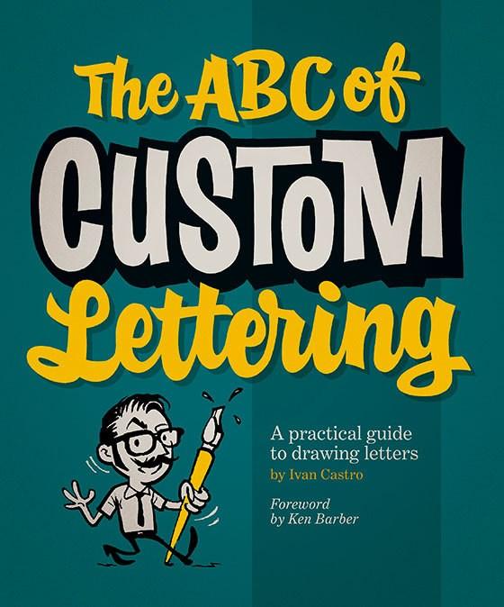
Need to produce a flyer? Want to draw up a logo for a band? Does your local speed shop need a T-shirt design? Don’t want to use the same old computer fonts? Well, let graphic designer and typography teacher Ivan Castro show you The ABC of Custom Lettering. This practical workbook features easy-to-follow, step-by-step guidance on hand drawing a range of letterforms, from Modern Roman and Gothic to Latin, Script, and Interlocked. It uses traditional instruction methods with a modern twist, and includes gallery sections for inspiration and exercises and projects that enable you to practise your technique. Ivan Castro is a graphic designer based in Barcelona, Spain, who specializes in calligraphy, lettering, and typography. His work involves everything from advertising to editorial, and from packaging to logo design and gig posters. Although Ivan claims to have no specific style, one could say that he has a strong respect for the history of popular culture. He has been working in the field for 15 years, and has been teaching calligraphy and lettering for 10 years in the main design schools in Barcelona. He travels frequently, holding workshops and giving lectures at design festivals and conferences.
-
-

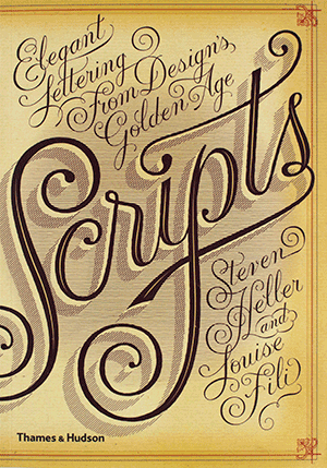
Scripts: Elegant Lettering from Design’s Golden Age
Ralf Herrmann posted a directory entry in Typography Books
Seen in everything from wedding invitations and birth announcements to IOUs, menus, and diplomas, script typefaces impart elegance and sophistication to a broad variety of texts. Scripts never go out of style, and the hundreds of inventive examples here are sure to inspire today’s designers. Derived from handwriting, these are typefaces that are stylized to suggest, imply, or symbolize certain traits linked to writing. Their fundamental characteristic is that all the letters, more or less, touch those before and after. Drawn from the Golden Age of scripts, from the nineteenth to the mid-twentieth century, this is the first compilation of popular, rare, and forgotten scripts from the United States, Germany, France, England, and Italy. Featuring examples from a vast spectrum of sources—advertisements, street signs, type-specimen books, and personal letters—this book is a delightful and invaluable trove of longoverlooked material. -
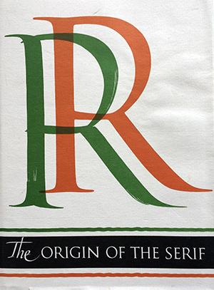
The Serif is the short cross stroke at the beginning and end of letter parts. Its origin in Roman inscription letters is one of the uncharted areas of paleography. In this book the author questions accepted theories as to the serif’s origin, and his own theory with skillful reasoning, detailed illustration, and epigraphic proof. Demand for copies of The Origin of the Serif has been constant since Fr. Catich published it in 1968. The information found there is not available elsewhere, and Catich’s theory on serif origins is not only original but persuasive. He connects it with a development of the Roman alphabet. Since the edition has been exhausted, Mary W. Gilroy, the Curator of the Catich Gallem', has prepared this new edition for publication.
- 1 review
-
- roman
- inscription
-
(and 1 more)
Tagged with:


