Jump to content
Your secret tool for flawless typography – Grab 40% off today!
  • Composing rule | Definition and Translations

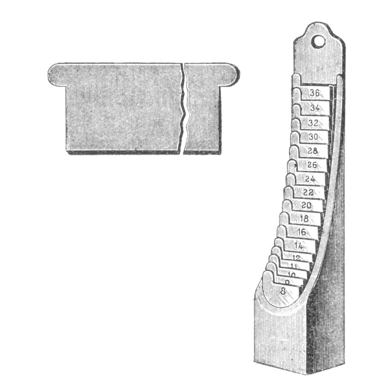
    Composing rules (or setting rules) are metal strips to be placed inside the composing stick to set the measure, to remove the line more easily or to set one line of type over another more easily.


    Dutch: zetlijnen
    German: Setzlinie
    Russian: наборная линейка

    Related Term(s): Composing stick


    Ralf Herrmann By Ralf Herrmann ()
    Contributors: bussket


    User Feedback


    thomas gravemaker

    Posted

    The "Setzlinie" is never used to set the width of the stick. In order to set the width of the stick, the typesetter places the amount of 'Quadraten' that are needed to attain the width and adds a very thin piece of paper between them, to obtain  a line that is slightly wider and that can be squeezed. Most typesetters had a set of quads for this purpose in a drawer. The reason: setting or composing rules are always slightly shorter or have slightly rounded corners in order to glide them in and out of the stick. Some of them have got one, others two lips. To set for instance a 20-cicero width, one takes 5 quads of 4 cicero long.

    Share this comment


    Link to comment
    Share on other sites

    Ralf Herrmann

    Posted

    Yes, it is certainly not common anymore, but I still left it in as one of the possible uses, since the glossary isn’t time-specific. And never say never. ;-) 

    Quote

    Composing Rules

    Before 1883, when United States typefounders agreed on the standard size for the pica, it was every founder for himself, and no composing stick could have an engraved pica scale on its bed. It was not possible to set the knee of a to a certain measure without the use of a set of composing rules. These were strips of steel made to different lengths, which could be put into a composing stick to set the measure.

    https://letterpresscommons.com/compositors-tools/

    Share this comment


    Link to comment
    Share on other sites


    Create an account or sign in to comment

    You need to be a member in order to leave a comment

    Create an account

    Sign up for a new account in our community. It's easy!

    Register a new account

    Sign in

    Already have an account? Sign in here.

    Sign In Now

Our typography network

Typografie.info – The German typography community
The type specimens of the world.
Discover the fonts from the Germany foundry FDI Type. A brand of Schriftkontor Ralf Herrmann.
The best typography links of the week.
Elfen-Fraktur—a monolinear blackletter typeface
×
×
  • Create New...

Important Information

We are placing functional cookies on your device to help make this website better.